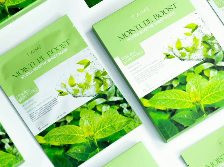
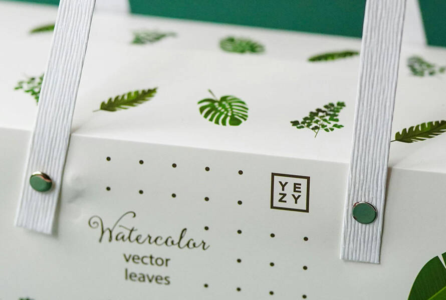
When it comes to packaging design, visuals grab attention — but typography does the talking. The right typeface not only communicates essential information but also shapes how customers perceive your brand. In today’s competitive market, typography isn’t just about choosing a font — it’s about creating a voice for your product.
1. Typography as a Brand Voice
Fonts carry personality. A bold sans-serif might signal modernity and minimalism, while an elegant serif suggests heritage and sophistication. In packaging, typography must:
- Reflect brand identity – The style should align with your values and target audience.
- Create recognition – Consistent font usage across all products strengthens brand recall.
- Set the mood – Playful, serious, luxurious, or eco-friendly — typography helps set the tone instantly.
2. Readability Comes First
No matter how stylish a font is, it must be easy to read — especially on packaging where space is limited. Key factors include:
- Font size & weight – Ensure important information like product name, flavor, or usage instructions is legible at a glance.
- Contrast with background – High contrast improves visibility in both print and online product images.
- Clear hierarchy – Use different weights, sizes, or styles to guide the reader’s eye.
3. Balancing Creativity & Functionality
While experimentation is part of modern design, the challenge is balancing uniqueness with usability. Creative typography can:
- Add visual interest without overcrowding the layout.
- Work alongside imagery to tell the product story.
- Highlight key selling points, such as “Organic,” “Limited Edition,” or “New Formula.”
4. Trends in Modern Packaging Typography
- Minimalist sans-serifs – Clean, bold, and easy to read.
- Custom lettering – Unique, hand-drawn styles for authenticity.
- Maximalist type – Large, dominating text that becomes the main design element.
- Retro revival – Vintage-inspired typefaces that evoke nostalgia.
5. Typography Across Different Packaging Formats
- Curved surfaces (like bottles or cans) where distortion must be avoided.
- Small formats (like sachets) where space is tight.
- Large panels (like shipping boxes) where bold branding can shine.
✅ Final Thought:
Typography is more than a design choice — it’s a strategic branding tool. The right type makes your packaging speak clearly, look beautiful, and connect emotionally with your audience.
At Packlet Design, we combine typography expertise with creative flair to make your packaging as impactful as the product inside.